Categories
Tweet Tweet Twitter

Tweets for 2009-04-20…

  • Gorgeous day in downtown! Waiting for my clients for what is going to be an awesome engagement session! #
Categories
Tweet Tweet Twitter

Tweets for 2009-04-19…

  • If I can smash @wedpick together with @shootq, I would finally have a pricelist that would allow clients to pick options easily. Thinking. #
  • Getting things together to take to the sign maker so I can have the new sign done for the studio, along with vinyl and Shuttercraft design for the windows. Whee! #
  • Sears Repair has seriously earned the FAIL on this situation: http://is.gd/sSg3 @shutterblog without an 18m old oven since 2/2. #searsfail #
  • zOMG. Got an email from a Roller Derby gal about booking a boudoir session, read her name & realized she was a college friend, 20 years ago! #
  • Houston peeps, be careful if driving. Flash flooding north of downtown with very heavy rain and low visibility. Nasty icky weather. #
  • Travel alert – Bad flooding on the feeder roads along I-45 North between 610 and Beltway. (Not tweeted while driving – thanks, @coffeemike!) #
  • Mother Nature tried to foil us, but I had an AWESOME boudoir session this morning, before the rain started to totally darken the sky! WHEE!! #
Categories
BlahBlahBabble

Stamped Logo Choices…

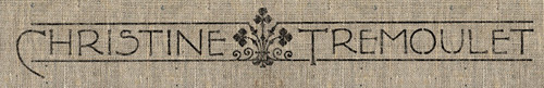
I’m at a crossroads in a decision, and the indecisive part of me can’t decide. I recently worked with Sara of Sadie Olive on redesigning the blog header for Christine Tremoulet. I love it. I’m thrilled with it. It coordinates with my studio, and makes it all feel so tied together. Thing is, we did a “stamped” effect on the logo (which I adore), and I’m trying to figure out if I should carry that effect over to my actual sign that I’m having made for the studio.

Stamped

It is either that or go with my logo “as is” instead:
The Logo

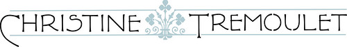
The logo colors would stay the same — I’m just trying to decide if I want it to have that slight texture effect.

Feedback? Thoughts? Ideas? Heeeeeeeeeeeeeeeelp…

Edited: I changed out the photo here because I realized it was confusing people. The sign that I plan to have made will be a light cream color, and will have the logo in blue/black on it. Just like the official logo above. I’m just trying to decide if I want the really crisp lines, or for it to have a more “textured” effect like the black logo on burlap above it.

The sign won’t be black lettering, it will be blue & black. It is the effect, how it looks like it is stamped, that I was asking about.

Categories
Tweet Tweet Twitter

Tweets for 2009-04-16…

  • Adding all of my favorite Houston photographers to my Vendors page on the blog, and I have the feeling I’m forgetting someone. Eep! #
  • It is finally live – @cybertoad has her own About page on the blog at http://tinyurl.com/d9bcx8 – need to add photos to it! #
  • Why must the ViaColori show overlap with my HHA Dinner tonight in the Heights? *sigh* I need a clone. I wish I could be at both!!! #
Categories
Tweet Tweet Twitter

Tweets for 2009-04-15…

  • Lots to do today – I need some Pure Energy. This song reminds me of living in Germany – the CD was our road tri… ♫ http://blip.fm/~4d7c7 #
  • Latest discovery? Online accounting, make 2010 taxes easier for your business! http://tinyurl.com/dxs6rb #
  • New proofbook just in – I’m so excited to be able to offer these to clients again! Nice companion for the DVD of high-res image files. Yeah! #