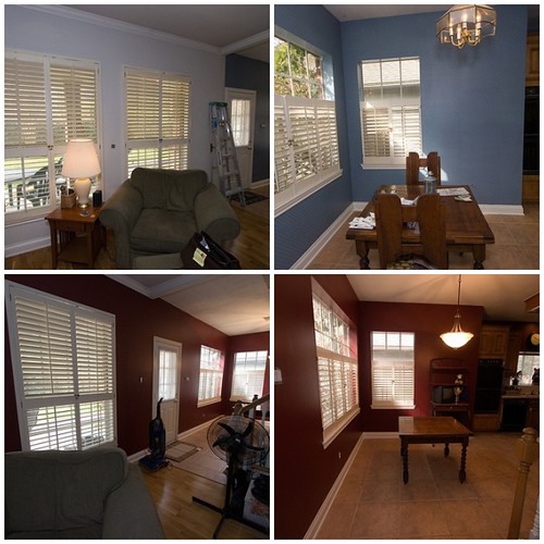
Finally! Kitchen photos! (Click any small photos for larger versions.) There are even more photos over on Flickr, but these are the highlights. First we will start with the before shots:

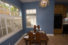
I always hated that the back wall was split into two tones. I had considered adding trim to make a dividing line, but eventually decided (after consulting anyone that would stop and listen) that it should be all one color. Then we had to pick a color. Oh, what fun.
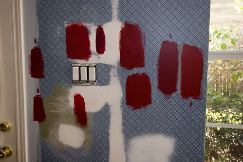
We ended up trying only one shade of green before we realized it was just sort of “blah” in the room. Then we tried 5 shades of red. We were going to go with Borscht from Sherwin Williams, second from the right in the above shot, but I was concerned that the hint of purple came through just a bit too much. Purple is opposite of orange on the color wheel, and it would make the cabinets and the floor look much more orange than it should.
We had a whole primer incident on Friday, along with a last minute paint color change. Originally, I bought Sherwin Williams 200 primer tinted to P5. The painter needed another can, so I went to pick it up. I didn’t write down what primer I needed because I had no idea that there were so many primers at their store. (I was tired and not firing on all cylinders. Oops.) So I called Mike and got the number, and the employee pulled a can to tint it for me. He handed it to me and I paid for it. Then I was looking at some samples again because something about the Borscht bothered me, and I told another employee (a female) about my concerns. She told me that Theatre Red was the same intensity and a very similar color, just with less purple. I was tired of painting swatches, and at that point just over it all. I bought three cans of the paint without ever seeing it on the wall.
I know, exactly what I think you should never do when selecting a paint color. Fortunately, it all worked out. I promised Mike that if it didn’t, I would repaint it myself!
However, I should have double checked the primer the guy sold me when I was still in the store. I had asked for the 200 primer, and he picked up the 400 can instead. There is enough of a difference in the formula that when the painter put it up on the walls in some places that he had to touch up, we had darker primer spots on slightly lighter primer. Splotchy places, all over the room. Of course, I discovered this about 6:12 pm on Friday, just minutes after they closed. Saturday morning I called and spoke to the manager on duty and told him my situation. I asked him if we should primer over it again or not, and he said that he would. It should be all one color so that we didn’t risk having weird looking walls when it was all done. He replaced the “wrong” primer for free, and then I had to break it to the painter that he was going to have to roll those walls all over again. Fortunately, that took him all of 30 minutes or so, and the primer is fast drying, so we were able to move on pretty fast.
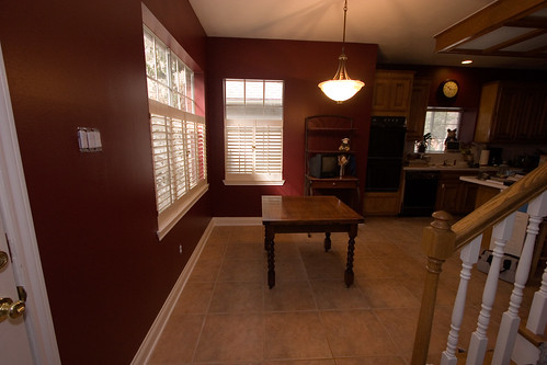
We also changed out the light fixture, and I am so glad we made that call. I don’t like the fluorescent lightbox, and Mike does. We like/dislike it for the same reasons – it is really, really bright. I suggested that if we changed out the other light, it would make the lightbox more tolerable for me since the new fixture is bright enough I don’t need to turn on the fluorescent lights if I don’t want to. It was a good idea and it looks great now that it is done. To make it even better, we put in a dimmer switch, so now we can make it ambient lighting or task lighting, depending on our mood.
Someday, we want to get rid of the breakfast table altogether – we have a huge island in the kitchen that seats 4 – and convert that area to a small coffee house like seating area. I’m keeping an eye out for inexpensive chairs and a coffee table that would do the trick. We already have a small iron table from Ikea that I bought last summer for the bedroom that we ended up not using that would be perfect. That way, Jason & I would have somewhere comfy to sit while Mike cooks and we can all be together! Plus we think it would be fun for when we entertain.
We are really happy with how it all came out, and it is amazing just how much it changes the mood in there. Half of the kitchen is still covered in dust and we’re not done moving things around yet, but as soon as we are I will post full kitchen shots later this week!
17 replies on “The Before & After Shots!”
It turned out great!! You did an awesome job!!
Looks great! Maybe this is the exciting color I need! Now what to do my hall that goes everywhere in my house…. I am considering hardwood in bedroom, dining room and living room, and hall with just tile in the kitchen. I love the beauty of the wood over the tile. But yours looks great!
I love your “new” kitchen! It’s gorgeous . . . you may have given me the courage to finally do something about the walls in mine!
That looks absolutely fantastic! Color choice is so hard, but you picked a great one. It really does change whole mood, doesn’t it?
I love the color. We painted our living room a dark raspberry color last year. I thought it was going to make the room very dark, but it really doesn’t. Enjoy your new look!
Beautiful. I love the color!
Wow…that red looks really dramatic! I love the way it looks with the wood color of the dining room table.
It looks great! I’m not a big fan of red in decorating, but you really pulled it off! Your project just might change my mind!
Great color!
It’s GORGEOUS. It’s times like this that I hate living in an apartment, ’cause we can’t repaint dark like that…but you’ve given me inspiration to attempt to finish up what we started a little while back!
Very nice. I like it. I like the light fixture, too. It all goes together very well.
Be gone hideous brass light fixture!!!
Lovely, just lovely. Our kitchen is red too, but it’s a bit brighter since our whole kitchen is 1950s retro. We just got done tiling the bathroom floor and redoing a lot of trim and other projects that surfaced along the way. Home improvement is not for sissies!
It looks great! You have a beautiful home.
Greetings from Malaysia!Just came across your blog. Wonderful kitchen you have there!
It looks wonderful! If you ever want to put your restoration skills to work, drop by! 🙂
That red is just gorgeous! No wonder you buy all your stuff in that color!
haha, i’ve would have sleepless night over the 3rd. picture